Noonan house
Service: Consultation & Floor plan
I worked with Jill & Colin to help them update their Victorian home on Price Edward Island. The home, known as the Jeremiah Noonan House, is a well-maintained heritage property built in 1897 that the couple had moved into. Photos by Jillian Stewart.
Capacity
When Jill & Colin purchased their home, many of the original details remained, such as the hardwood flooring throughout, wide woodwork, mouldings and wainscotting, three double mantles (two with original oil paintings), and other incredible details like a grand staircase with a beautiful stain glass window on the landing. The house was much larger than their previous one and they were looking to make some more modern updates while maintaining the character and integrity of the home.
This was not a full design service project—it was a collaboration with the homeowners by offering guidance and support through one of her design consultation packages. I laid the groundwork with a colour palette, mood board, suggested floor plans, and recommended furniture dimensions—the clients sourced pieces and did their own styling and decorating.
Their aesthetic is fun, textured, eclectic, and sophisticated but laid back. With more rooms than they had furniture to fill them with, designs were created for each room with a purpose in mind. This consultation focused on two rooms: the family room and a record room.
Design details:
original woodwork
When it comes to mouldings in Victorian homes, the decision to paint over stained trim is a personal choice and can be a tough call to make. In deciding whether to keep the existing wood trim (embracing the existing stain) or to paint it, I pulled visuals and inspiration for both options and they ultimately decided that keeping the trim in its original stain was best for them:
they liked it
it helped them achieve a cohesive look throughout the home
it didn’t encroach on their budget or timeline
Intuitive Palettes
When creating a colour palette for the space, I focused on patterns I picked up on from clothing in their closets, existing artwork, their favourite pieces of furniture, and stained glass already in their home. I suggested varying shades of navy, red, yellow, and green in each space to add depth, work with pieces they already owned, and compliment the intensity of the wood trim.
To brighten the rooms, they tore down the existing wallpaper and painted each room in a crisp white. The contrast of the white walls against the dark trim created a fresh, clean, and modern but soft atmosphere.
LIFESTYLE AND DESIGN
Jill & Colin love filling a home with music and have an impressive library to pull from. A formal sitting room was turned into a space where they could kick back and enjoy their extensive record collection. Built-in shelving was created to house it while blending seamlessly with the character of the room, and acting as a main feature in the space. Since they also love hosting friends and family, it was a priority to include extra seating wherever possible in both rooms — pieces that would be both comfortable for guests and refined, but not too formal for daily use.
Where the record room is off the dining room, they opted for an arrangement that would enable casual hangouts pre and post-dinner without hindering the view to company on either side. In the family room, they added a comfy sectional they could curl up on with two leather armchairs seated across.
A loose and laid-back gallery wall was suggested to go behind the sectional in their family room. Jill & Colin curated this using their existing art, including music posters and sentimental pieces that helped to tie their colour palette together.
Record Room: After
Record Room: Before
Family Room: After
Family Room: Before
Exterior painting
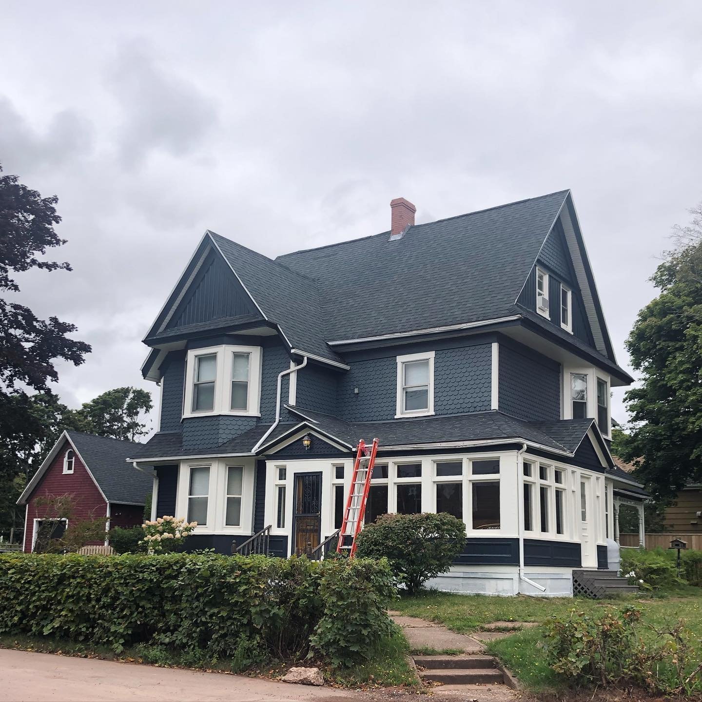
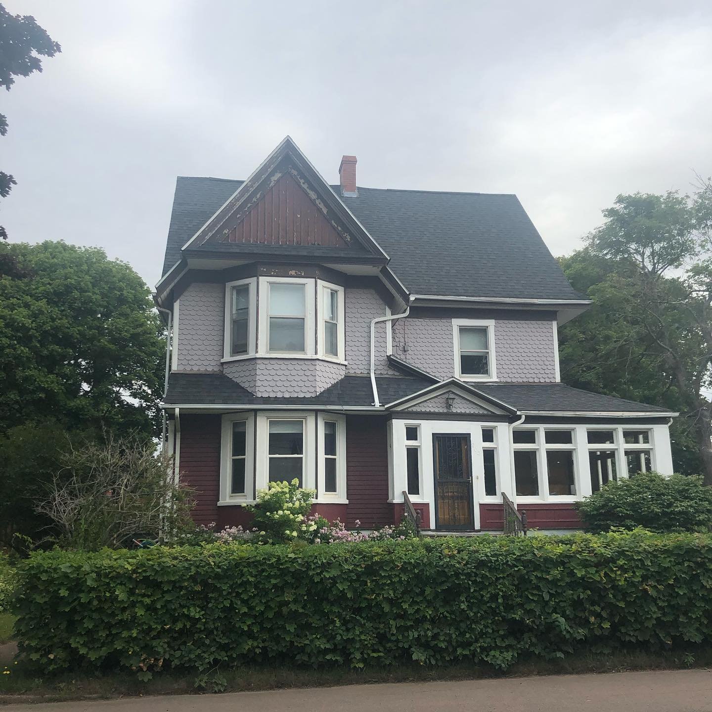
I was later brought on to help select exterior paint colours for an exterior refresh. We went with Benjamin Moore’s Soot, Anchor Grey, & Swiss Coffee. A before photo is included in the gallery below.
“Maia's design consultation took all of the anxiety and guesswork out of decorating our home. We had no idea where to begin with filling our house with furniture and decor that felt like 'us' and suited the space. Maia's mood board and floor plans gave us a framework that clarified our vision and made it easy for us to bring our own taste to life, and to incorporate what we already owned with some fun new finds.”
— Jillian Stewart


